CLIENT
Bon Voyage, a travel itinerary app
CHALLENGE
Create a mobile app that helps travelers plan and maximize their time in a collaborative fashion.
DELIVERABLES
Domain research, user research, visual design, mobile high-fidelity prototype, usability testing
TIMELINE
6 weeks
THE CHALLENGE
Design a product from scratch
Design an app geared toward millennial travelers that provides information and recommendations about where people can go and what to see in different cities around the world.
Wear many hats
I was researcher, architect, UX designer, and UI designer on this project. As a big picture thinker, I was up for the task.
THE APPROACH
User-first
Keep the traveler’s needs at the center of every decision
Start on paper
Sketch on paper first to maximize time and stay fluid with design concepts
Iterate often
Make changes incrementally as feedback is received in order to ship the best version of the product at the end of the 6 weeks
UX RESEARCH & DESIGN
Understand the competitive landscape
The travel industry is extremely saturated. From a business perspective, what are some of the big players doing well? Where are the gaps in the mobile app travel sector? My goal for every project is to differentiate the product.
Competitive analysis
I reviewed the mobile experiences of three direct competitors and three indirect competitors to understand how I could differentiate the Bon Voyage experience for users, while meeting best practices that travelers expect.
Gaps Bon Voyage can fill:
None of the big travel planning players offered a collaborative planning experience.
Competitors’ photography is inconsistent and not visually inviting or attractive.
Industry standards to emulate:
Robust search and filter capabilities
Detailed descriptions of activities
Understand the travelers and their problems
With such a broad challenge, the next order of business was to find out what millennial travelers want from a travel experience. Where do they find travel inspiration? What challenges do they face? What do they value when traveling? Then and only then could I design solutions for those challenges.
Identifying the traveler
I synthesized three interview transcripts to create a user persona. Meet Ashley.
Defining the problem
Ashley’s top priorities:
Based on those three priorities, I wrote this statement, which guided the my design process:
The Frugal Millennial Traveler needs a way to squeeze in as many genuine culture experiences into their trip while staying on budget, because they want to get the most bang for their buck and share new experiences with friends.
Define design principles
Because I was tasked to design the UX and UI of the app, design principles were key to ensuring the cohesiveness between the function and form.
I wanted the traveler to:
Trust that they are accessing credible, accurate information
Feel like they are seeing all of the possible nearby attractions and that they don’t need to go to other apps or top 10 lists to find out what to do
Feel confident that their vacation will happen smoothly
Humanize the traveler through user stories
The app will be used by real people, so in order to bring the traveler to life, I wrote user stories that outline the three goals of the platform. These stories outline the main actions the app should allow the traveler to perform.
“As a meticulous traveler, I want to know what all of my activity options are so that I can choose activities that maximize my time and budget while on vacation.”
“As a social traveler, I want to be able to collaborate on a travel itinerary before I book so that I can share new experiences with my travel partner(s).”
“As a frugal traveler, I want to make sure I don’t miss a scheduled attraction and waste time and money.”
Build the bones of the app
Confident that I understood the traveler’s needs and pain points, I jumped into creating the structure of the app.
Define content strategy
I outlined the content needed for the app before jumping into information architecture. I made a list of information the traveler needed to complete registration, browsing, scheduling, and booking. Methodically contemplating the content strategy enabled me to create the app map efficiently and to identify how many wireframes needed designed.
Create an app map
I created the app map using my content strategy efforts to ensure that all functionality and needs were met in the structure of the app. I organized the content in a few different ways before landing on this structure.
App map
The bottom navigation is simple: It includes home, trips, and accounts tabs. Necessary information is intuitively nestled within each option.
Interview insights revealed that travelers like browsing different ways depending on the goal of their travels. To accommodate the different priorities, travelers can explore by budget, rating, location, recommendations, and trending.
After browsing, travelers can create a new trip, add collaborators, edit current trips, and view past trips.
The app map ensures that the product requirements flow together in an intuitive way.
Design mid-fidelity wireframes and prototype
Guided by my app map, I sketched a rough paper prototype to stress test my user flow, then designed mid fidelity wireframes in Sketch. I worked through user flows, implemented content strategy, and optimized labels during the wireframing process.
Once the mid-fi wireframes were clean and consistent, I created a clickable prototype in Invision, which is a great way to get feedback and buy in with minimal investment.
UI RESEARCH & DESIGN
Research the visual landscape
Before taking my mid-fidelity wireframes to high-fidelity, it is vital for my process to conduct (you guessed it) research.
The visual research ensures that I’m understanding the traveler’s mental model while differentiating Bon Voyage from the competition.
Visual competitive analysis
Competitors who stood out used consistently styled photos and dynamic typography. Many competitors lacked effective visual hierarchy and had trouble displaying a large amount of information on a small screen in a palatable way.
By displaying necessary information in a simple, easy to understand way, Bon Voyage will rise above the competition
Travelers are influenced by Instagram and travel blogs.
I deferred back to the traveler to understand their visual preferences and expectations. Travelers find inspiration on travel blogs and Instagram travel accounts, so that’s where I started. I took note of the type of imagery and typography that was being used.
I didn’t want my design to blend into the background, but I wanted it to be familiar to the traveler.
Set goals for the visual brand
Goal setting is vital to an effective design. The goals I set influenced the two design directions I pitched.
I wanted the traveler to:
Feel delighted with the experience
Be inspired to plan their next vacation using the app
Wish she were on vacation right now
Explore the visual options
Concept 1: Bright and Carefree
Our target travelers use Instagram for inspiration, so this direction ties in beautifully curated and edited photos in a bright, engaging way. I gathered inspiration on a mood board and then refined my ideas on a style tile.
Mood Board 1
I experimented with a thick stroke script-like display font inspired by 1950s travel ads paired with a dependably structured sans serif font. This pairing creates the sense that the traveler’s vacation will be adventurous yet streamlined. Passport stamps on paper led me to the image of the travel scene cut out of paper. It’s bright, fun, and creative. And what says vacation more than the colors of water, sun, and sand!?
Concept 1 mood board
Style tile 1
I chose clean, bright photography that highlights one main subject and features rounded corners to evoke a sense of easiness in anticipation of the upcoming vacation. The vibrant color palette communicates that adventure is right around the corner. I chose simple line icons to communicates simplicity and openness.
Concept 1 style tile
Concept 2: High-end Editorial
This concept says “you’re about to go on a designer vacation.” It aims to bring celebrity vacations into reach.
Mood board 2
This style is high-end, editorial, crisp, and warm to evoke a sense of luxury and polish. The serif display font establishes a sense of high-end groundedness, while the sans serif brings a touch of modernity to body copy for legibility. The color palette was inspired by a cozy yet minimal home. Gallery walls, rich leather, and warm furnishings inspired the organized yet homey layout.
Concept 2 mood board
Style tile 2
I chose the clean, bright photography that our Millennial travelers expect to see and cropped the images into clean crisp squares to establish the feeling of organization and symmetry. The color palette is soothing and sophisticated. I chose solid icons to ground the design and feel stable.
Concept 2 style tile
Apply visual direction to create hi-fidelity prototype
I decided to move forward with concept one because it best achieves the visual goals I set for the project. The bright colors and playful typography invoke a sense of excitement while using the app.
Next, I applied the visual design direction to the mid-fidelity wireframes that I had designed.
High-fidelity wireframes before being turned into an interactive prototype.
Usability testing
I conducted usability testing with two Millennial travelers to better understand how easy the app was to navigate, where the app created confusion, and how desirable the features were.
Overall, the two users that completed usability testing were pleased with the visual aesthetic of the app overall. They found the UI clean, organized, familiar, and intuitive.
The majority of tasks were completed without error, and those that were completed with error could have been avoided had the tasks not been presented in a misleading order. I suggest testing again to confirm my hypothesis.
I plan to add an initial onboarding prompt when visiting the home screen for the first time, which will address confusion about semantics.
I plan on A/B testing a heart save button and a + plus button to see which provides more clarity when saving an activity to a trip.
Due to time constraints, I implemented smaller points of feedback and ended up with the following iteration.
SOLUTIONS
Recommendations are vital
Travelers are overwhelmed by the amount of possible activities and modes of transportation when planning. They need accurate attraction information and recommendations on how to get from point A to point B.
The traveler tells the app what kind of activities they prefer during onboarding, which helps the app provide the best recommendations.
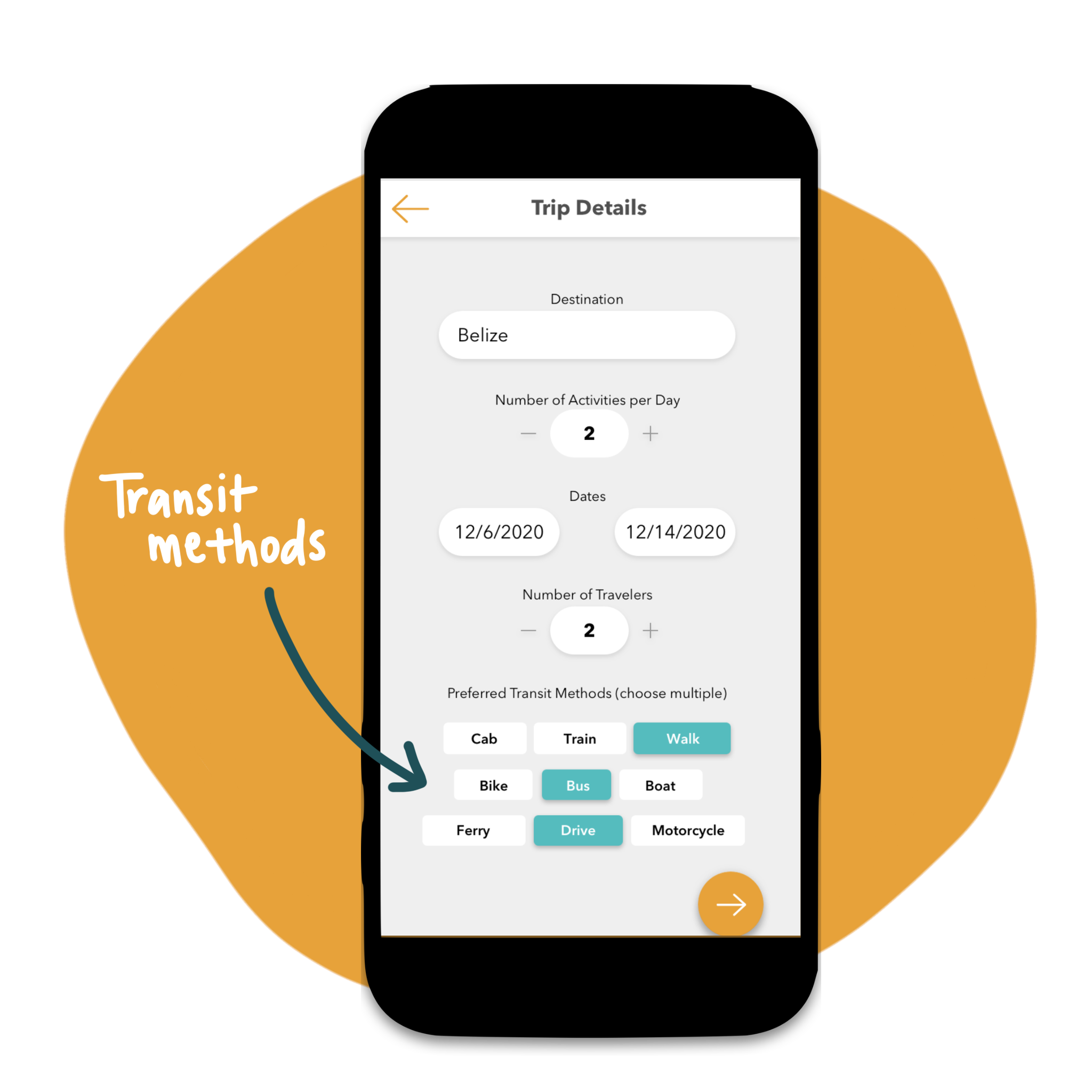
When creating a new trip, the traveler is asked to specify how they prefer to travel so that the app can suggest the best modes of transportation.
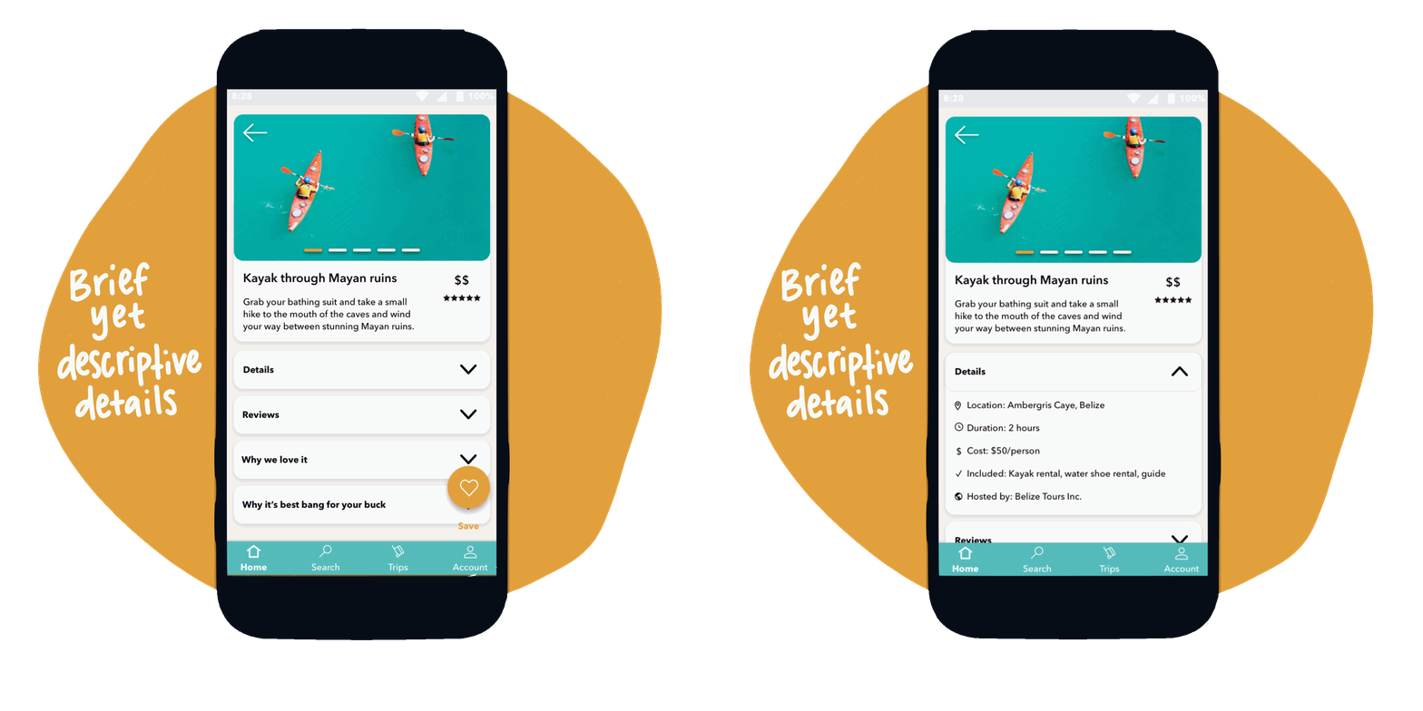
Activity descriptions are brief yet descriptive, providing an easy process for travelers. Travelers can add activities to their pre-made trip or make a new trip at any time.
Want to learn from locals
Travelers want authentic, off the beaten path experiences, and they definitely want to avoid tourist traps; all on a budget!
Multiple ways to search
Adventure seekers can search by most genuine experiences.
Budget-conscious travelers can search for the best bang for their buck.
Need to maximize their time and money
Travelers need help getting from point A to point B. They want to see as much as possible on their trip, so they spend a lot of time and energy researching activities and transportation.
The app automatically generates an itinerary with travel times to and from destinations to help travelers maximize their time.
Collaborative trip planning
Travelers like exploring the world with friends and significant others, but planning a trip together is difficult and complicated. They want a streamlined place to collaborate.
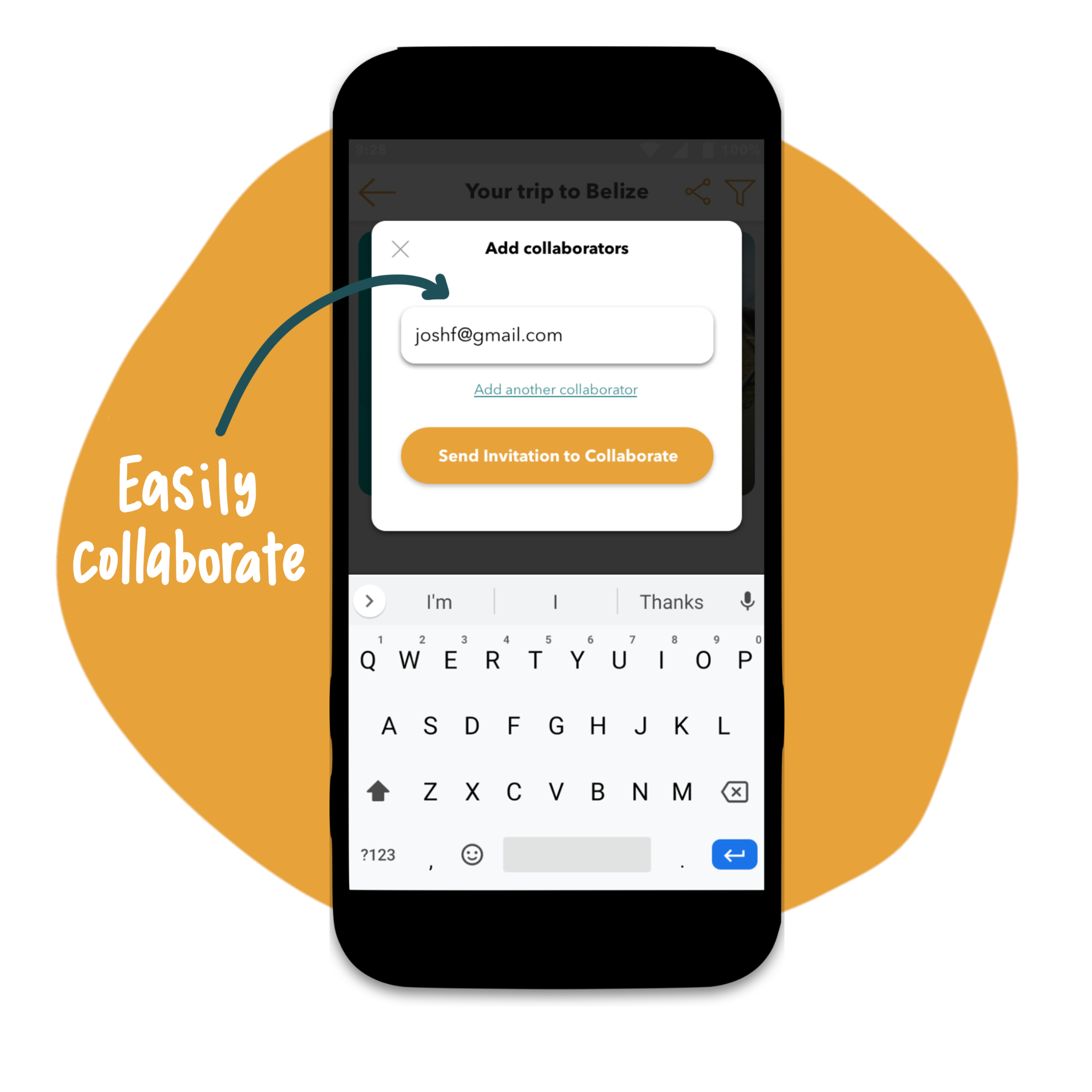
Easily add collaborators to your trip so they can add new activities and access the itinerary online and offline.
Travelers can add events on their itinerary such as meetup times, free time, group photos, and more to keep the group operating on the same schedule.
Offline access for a seamless trip
A pain point shared during user interviews was the inability to access travel plans offline. Depending on location and weather, internet service can be spotty. Bon Voyage solves that pain point by offering offline access to their itinerary and a map.
I designed this screen with the purpose of visually differentiating the post-booking experience from the pre-booking experience to alleviate potential confusion between trips in the planning stages and trips that have been booked and paid for.
OUTCOMES
Implement further user feedback
As it currently stands, Bon Voyage addresses the user problems I set out to solve, but as is true with every project, more testing and iteration can make the experience more user friendly. If this app were to continue to development I would make the following changes according to usability test results:
Explain what collaborators are during onboarding
Add a map view on the activity details page so the traveler can get more context before saving to the itinerary
Add autofill when choosing destination to ensure the traveler that they’re searching in a known location
Inform travelers how to update preferences when they’re being chosen during onboarding
REFLECTIONS
I would have preferred to interview 8 participants in person. Gleaning actionable insights from three interview transcripts was challenging, but I supplemented with plenty of industry research as a workaround.
Another challenge of this project was the timeline that didn’t allow for concept testing at the mid-fidelity and branding stages. That feedback would have ensured a more desirable and useful product in the end.
In all, I loved tackling the research, UX, and UI of the product. I got to flex the analytical side of my brain and translate my findings into creative yet useful interpretations.
SEE MORE WORK
One Onsite
Mobile app for tech-averse trades people
Schedule calendar
Enterprise software with data-heavy interface.


